You put in a lot of effort to research website design trends to get people to click on your link ad and visit your website. Furthermore, you have made your website more user-friendly to the best of your ability. But why aren’t they spending more time on the web pages?
Why is the conversion rate so low compared to other websites? On the other hand, your competitors are dynamic and keep up with website trends. As a result, customers prefer to spend more time on their websites. You can also choose to follow these trends to increase the number of people who interact with your website.
Quick List To Top Ten 2022 Website Design Trends
- Dark and Light Themes
- Overlapping Elements
- Human-Like Chatbot
- Big Buttons
- Personalized Content
- Intelligent Content Loading
- Cinema-Style Homepage
- Mega Footer
- Fun and Optimistic Designs
- Over-Size Pointers
Today, we’ll look at some of the new website trends that will be popular in 2022.
1. Dark and Light Themes
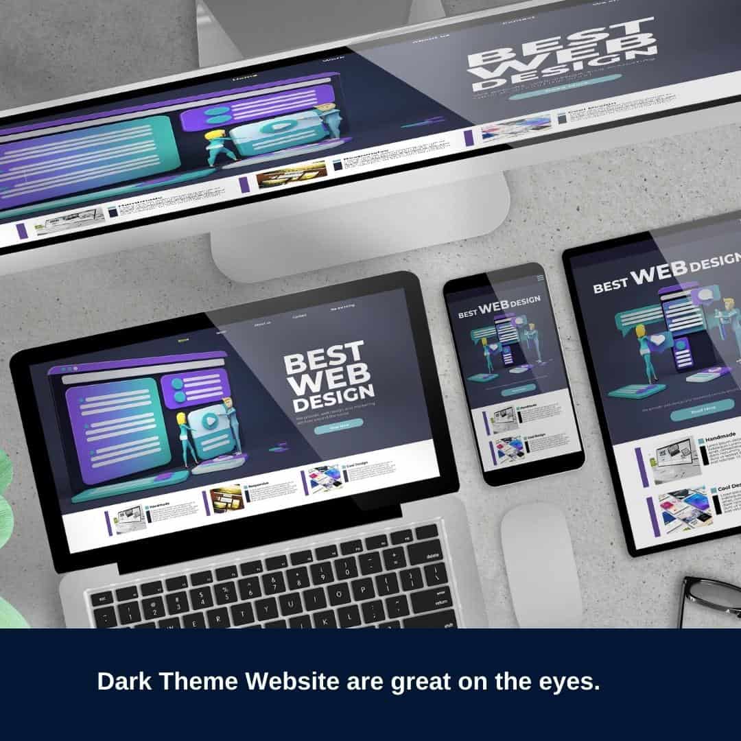
As much as the dark and light themes are trending, they are something that people will end up adopting for a long time. They make it easy for people to navigate the website because they can alternate between the light and dark modes. Many search engines and applications support these modes, so you should not have any problem implementing them.
The dark mode is great when users use phones in low light to access your website, reducing eye strain. During the day, they can switch back to the usual light mode.
2. Overlapping Elements
Nowadays, developers design websites with overlapping elements, which draw attention to what you want your clients to focus on. Overlapping elements involves using different shapes, contrasting colors, and other aspects like a magnifying glass. For example, you will find websites with graph pictures on a rectangular page that use a magnifying glass to focus on a specific part of the graph.
Overlapping elements help increase the clarity of your website for users, which increases the conversion rate. However, it would help if you were careful not to use too many overlapping elements, making your landing page too busy.
3. Human-Like Chatbot
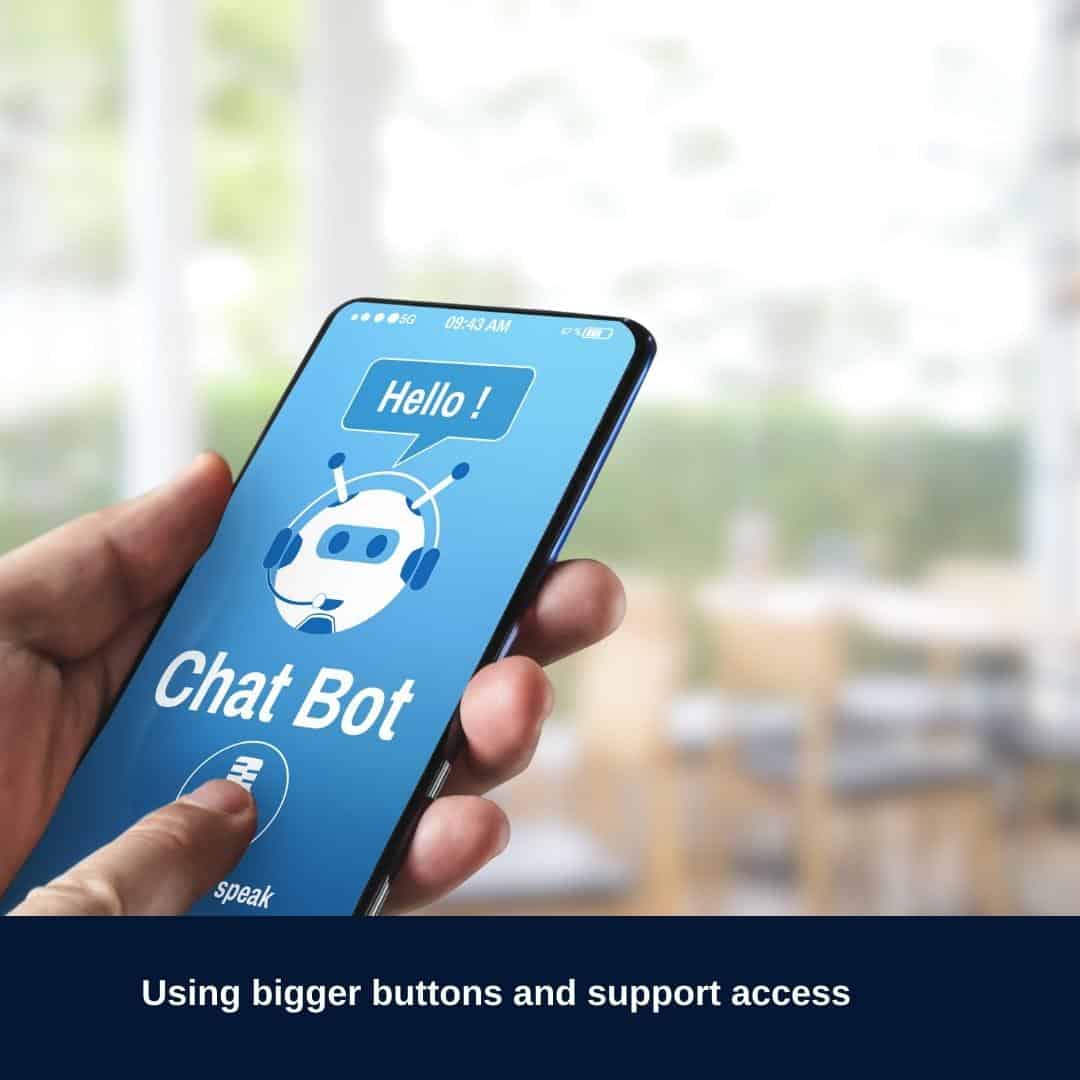
The invention of the human Chabot has really helped both users and business owners navigate a website. Immediately a user gets on the landing page, and they receive a message from the bot asking if they need assistance. The bots pause as assistants, and it is difficult for users to distinguish whether they are real or bot. Users can type in a textbox to interact with the virtual assistant or bot when they struggle to find items or information on your site. They find leads, interact with them, and direct them to purchase items.
The bots perform tasks that customer care agents would have done, which reduces the workload in that department. Therefore, you don’t have to hire more employees in that sector. See this guide for chatbot guides for 2022. This is in depth info for developers.
5. Personalized Content
Current internet users actively search for information online, and they like information that they can quickly and easily consume. Users easily get bored when they have to go through several processes before accessing the information they need. They don’t like going through various pages or reading through several blogs to find information about your product.
As a business owner, you can make the information quickly accessible through personalized content. Personalized content includes user-defined keywords that make search tools accessible to access the information they need. This trend will definitely last longer than a year.
6. Intelligent Content Loading
As we have seen, users these days are impatient, and when they come across a website that takes a long time to load, they click away. That is why you need a website that loads and scrolls fast. High-quality videos and graphic designs are great, but they need a lot of bandwidth to load. However, you can use an intelligent content load that only loads what the user wants to see. Instead of using the bandwidth on the content they don’t need, the website uses the available bandwidth exclusively for what the user needs.
Adopting this trend ensures that your users can quickly acquire and retrieve information, which helps your business collect leads and sell products.
7. Cinema-Style Homepage
The cinema-style homepage will definitely last through 2022 because it helps active information seekers quickly gain information through videos. The vignette, slow motion, and other short videos give users information and instructions, which reduces their need to read through written content on your website.
It also reduces monotony on your website by eliminating text and adopting various forms of videos.
The cinema-style homepage captures the users’ attention, which is also a great way to attract and maintain visitors to your website.
9. Fun and Optimistic Designs
You can choose to decorate your website in many ways, but a bland aesthetic is not something we are adopting for 2022. Users can add fun shapes, drawings, and pictures to websites and portfolios. We understand that corporate websites don’t want to make their sites look informal.
However, they can use professional images that evoke happiness when users scroll through the web pages. Others can also use bold fonts and contrasting colors to make the website fun and optimistic. Keep in mind that everything has a limit before your website gets busy and distracts the user from performing the vital action: interacting or purchasing your services.
10. Over-Size Pointers
You can make your website interactive by using mouse hovers or pointers. Here, part of the information is blurred or dull, which blocks the users from seeing it unless they point their mouse or hover over the news. This method is excellent because it blocks other information, and the user will not get distracted when performing a task. In the end, users will either complete a purchase or sign up to your email list.
Conclusion
You can incorporate the top web design trends in 2022 into your website now that you are aware of them. The great thing about these trends is that you can include them without starting from scratch. You choose to do it on your own by searching for resources online.
On the other hand, you can hire a freelancer or webdesign outsourcing company who will add the features for a fee. Ensure that you are not missing out on capturing leads, improving interaction, and increasing conversion rates, as this is the goal of a website.
