The Influence of Color Psychology in Web Design
Color psychology is a cornerstone of effective website design, wielding the power to captivate, engage, and influence users. By understanding the psychological impact of colors, designers can craft compelling digital experiences that resonate with audiences on a deeper level. Let’s delve into the fascinating realm of color psychology in website design and uncover the strategies behind selecting the perfect palette for online success.
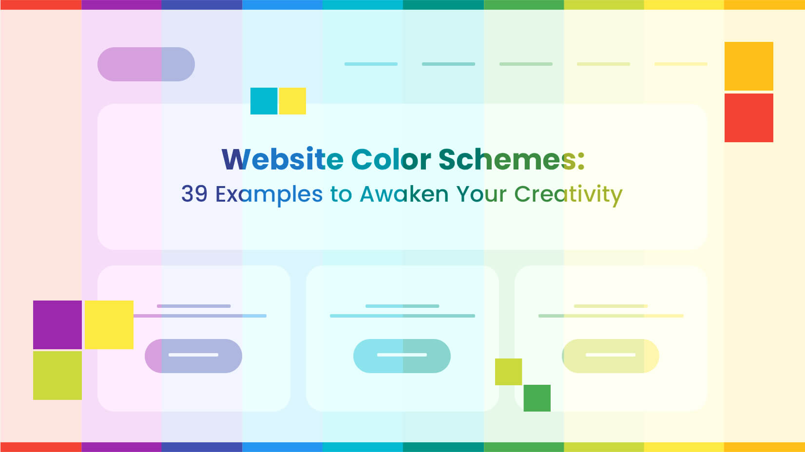
Painting Digital Experiences
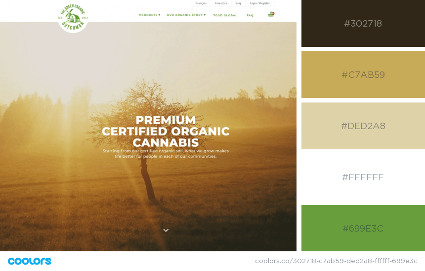
Colors play a pivotal role in web design, each carrying its own psychological connotations. Red is an energetic color that grabs attention and is great for calls-to-action and promotions. It can evoke passion and urgency, making it ideal for marketing campaigns. Studies show that it can increase heart rate and excitement, making it valuable in advertising contexts. Corporations and financial institutions commonly use blue to signify trust and create a professional and reliable image. Eco-friendly and health-related websites often feature green, which symbolizes harmony and freshness and represents growth in nature.
Emotional Impact of Colors:
Understanding the emotional impact of colors is essential for creating compelling user experiences. Warm colors (red, orange, yellow) encourage action and create excitement. Cool colors (blue, green, purple) promote relaxation and trust. Neutral colors (white, gray, beige) provide balance and a modern aesthetic.
Brand Identity and Color Association:
Consistent use of color is crucial for reinforcing brand identity and fostering brand recognition. Colors become synonymous with brands, helping users associate specific hues with products or services. Consider cultural norms and audience preferences when choosing a color palette, as color associations can vary depending on these factors.
Guiding User Experience with Colors:
Color can be a powerful tool for guiding user behavior and enhancing navigation. Strategic color use highlights important elements, like buttons and links, to improve usability. Contrast, hierarchy, and accessibility are critical for effective communication and a better user experience.