Choosing the Right Colors for Your Website Design
1. Understand Color Psychology
Colors influence emotions and behavior. For example:
- Blue: Trust, stability, professionalism
- Red: Energy, urgency, passion
- Green: Growth, health, tranquility
- Yellow: Optimism, warmth, creativity
Choose colors that align with your brand’s message and values.
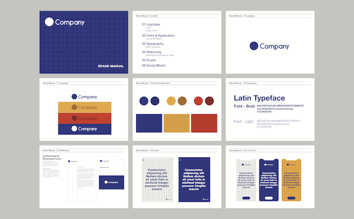
2. Start with Your Brand Identity
Your website colors should reflect your logo and overall branding. Consistency across digital and print materials builds recognition and trust.
3. Consider Your Target Audience
Different demographics respond to colors differently. For example:
- Younger audiences may prefer bold, vibrant palettes
- Professional or luxury brands may opt for muted, sophisticated tones
4. Use the 60-30-10 Rule

This design principle ensures balance:
- 60%: Dominant color (background or large areas)
- 30%: Secondary color (supporting content areas)
- 10%: Accent color (buttons, CTAs, highlights)
5. Ensure Accessibility and Readability
Make sure your color choices are inclusive:
- Maintain a strong contrast between text and background
- Avoid color combinations that are hard for color-blind users to distinguish
- Test your palette with accessibility tools like WCAG contrast checkers
6. Test on Multiple Devices
Colors appear differently across screens. Preview your design on desktops, laptops, tablets, and phones to ensure consistency.
7. Draw Inspiration from Design Tools
Use tools like Adobe Color, Coolors, or Canva’s color palette generator to experiment with combinations before finalizing your design.
Conclusion
Choosing the right colors for your website is a strategic decision that blends branding, user psychology, and accessibility. A well-chosen palette not only makes your site visually appealing but also improves user experience and supports your business goals.


